
-
Art Direction
Visual Identity Design
Typography Exploration
-
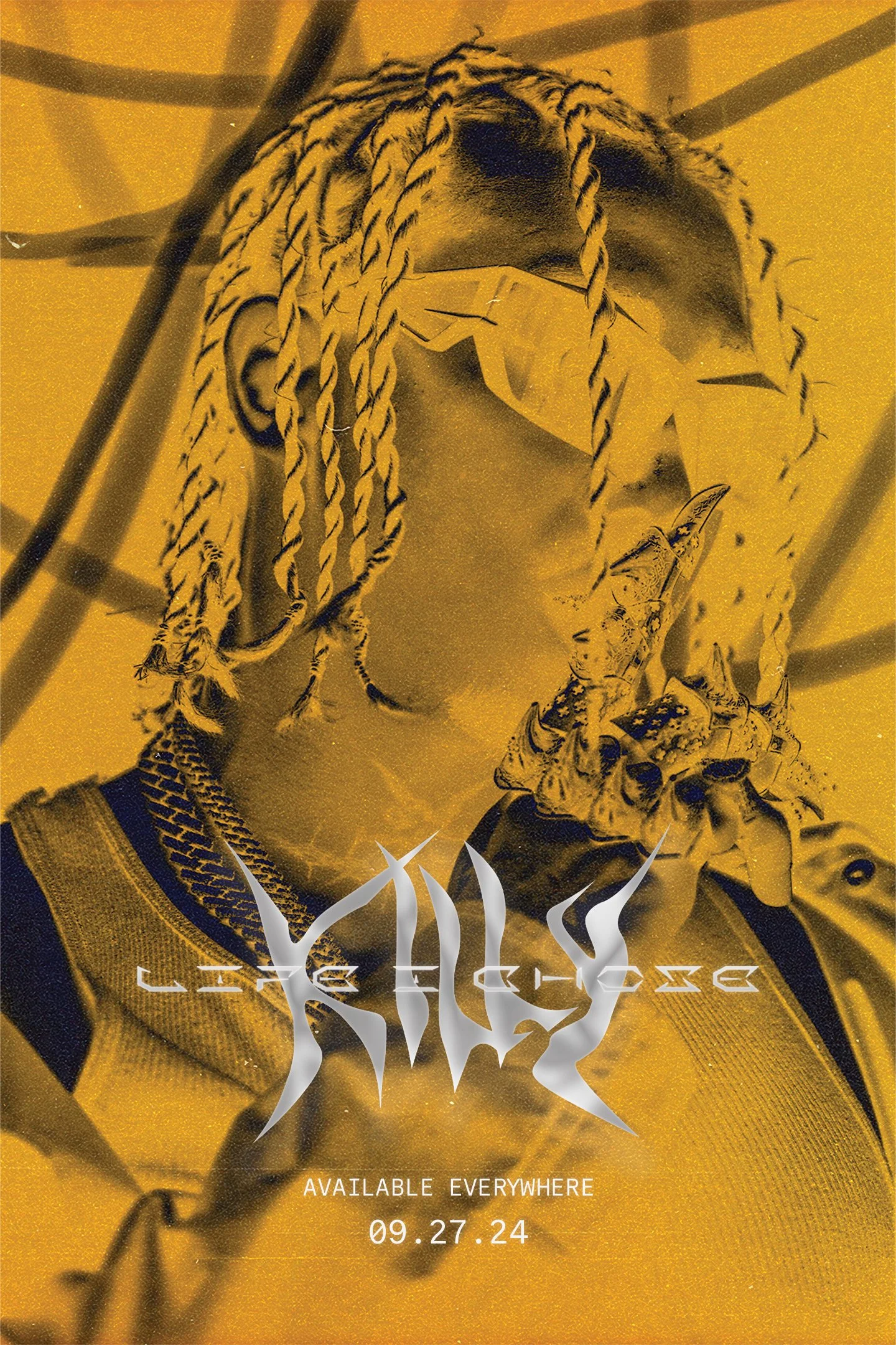
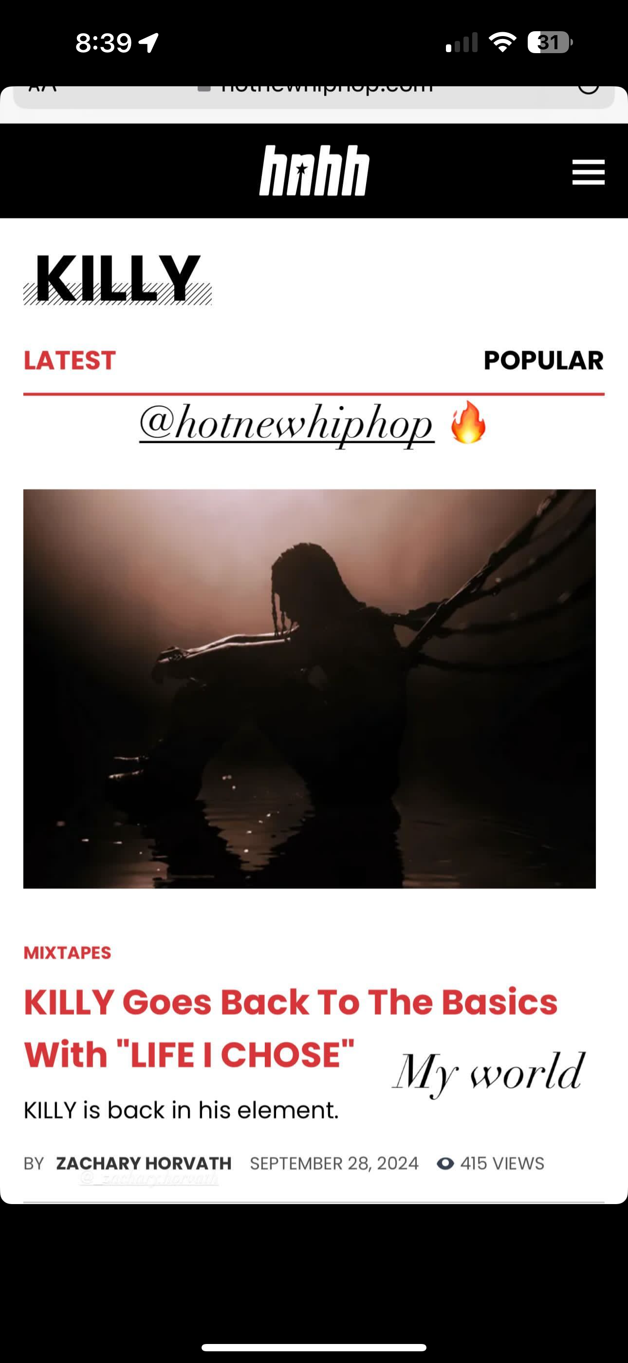
KILLY — Canadian Rap Artist
-
Year: 2022
Artist: KILLY
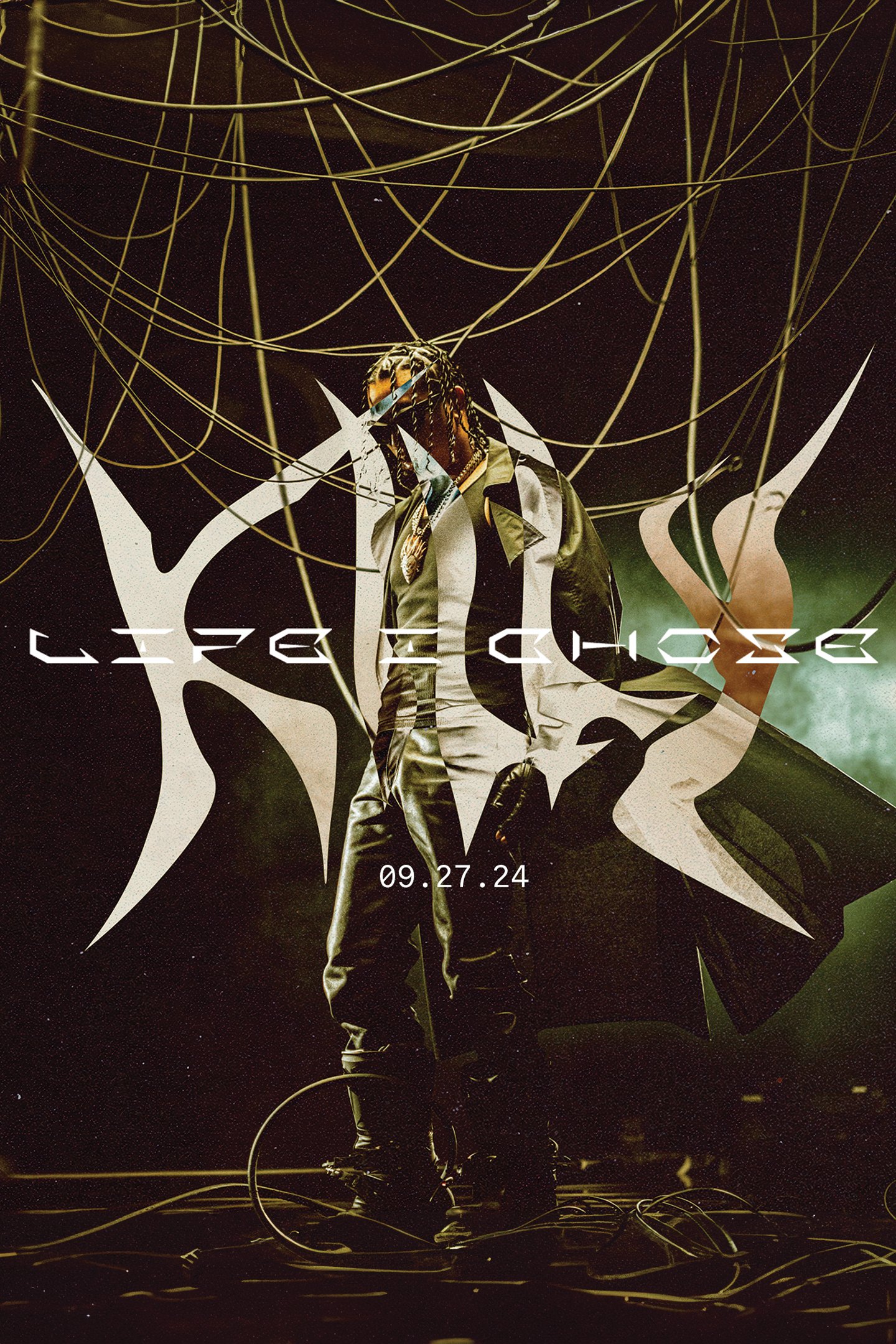
Project: Life I Chose Album Identity
Location: Toronto, Canada
Creative Studio: ALT Studio Lab
LIFE I CHOSE ALBUM
More than an album or a visual campaign, this project was about building a world fans could step into. It wasn’t just branding, it was an invitation into a universe that feels alive and larger than life.
ALBUM IDENTITY


For KILLY, I was inspired by the cyber-futuristic visuals that shaped my teenage years, movies like Blade Runner 2049, Dune, and The Batman, and the dark, dystopian games I grew up with.
MOODBOARD - THE VISION TAKES SHAPE


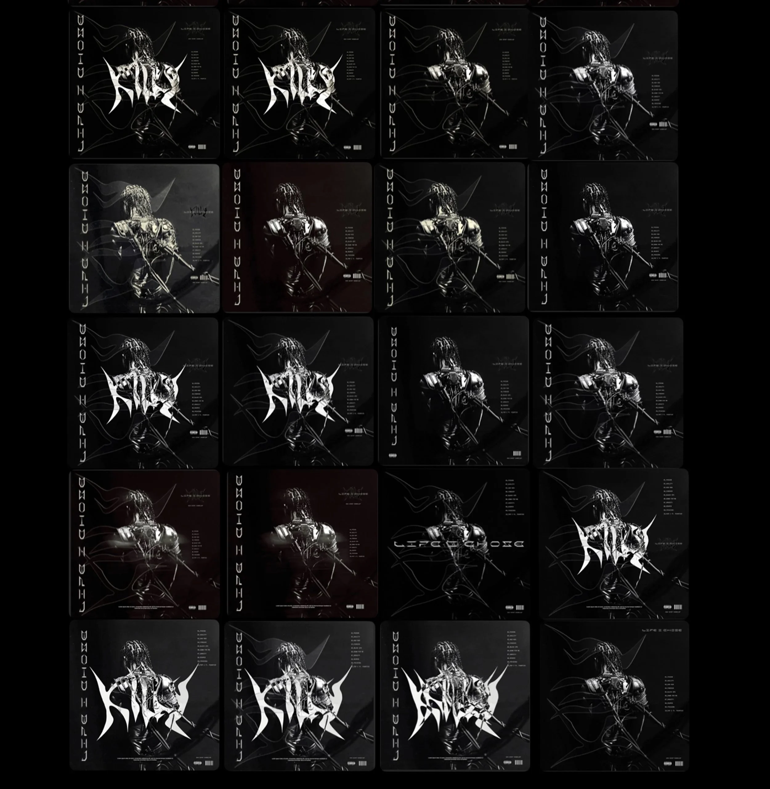


COVER ART & TRACK LIST
For the album cover and tracklist, AI wasn’t just a tool, it was a creative puzzle. Killy envisioned body armor fused to his form, so rather than relying on simple AI prompts, I strategically generated and refined each section until they seamlessly connected.


MERCH - WEARABLE STORYTELLING
The merch is designed to pull fans into KILLY’s universe. The distorted tower behind his logo reimagines the CN Tower through a cyberpunk lens, grounding the concept in his Toronto roots.
This is just a prototype, Not for sale.